When a remastered version of a game comes out, people invariably want to know how it compares to what came before. Things like feel, gameplay and audio are important – and based on our hands on time at Gamescom, BioShock: The Collection is certainly playing well enough – but everybody’s go to yardstick for how far things have improved is the visuals.
That means that the good folk of the internet – ourselves included – find themselves creating side-by-side graphics comparisons to show the differences (like this one we did for Uncharted 2’s belting helicopter scene). Thankfully, this time around 2K Games have saved us all a lot of effort by putting together this BioShock: The Collection graphics comparison trailer, which they unveiled today at Gamescom 2016 in Germany.
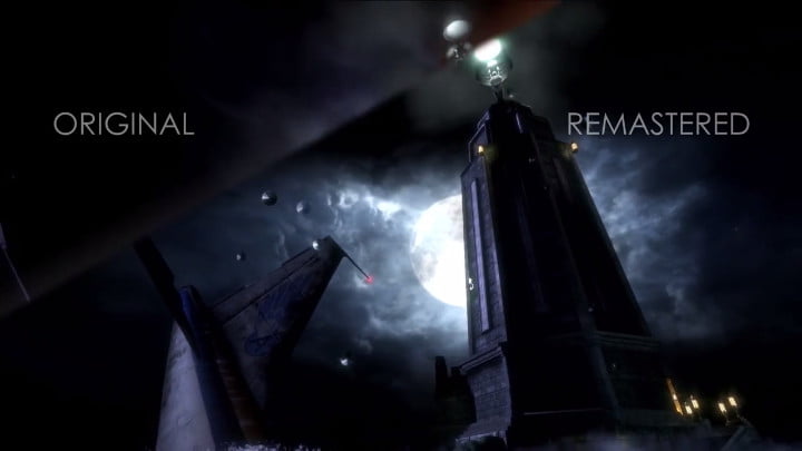
The BioShock: The Collection graphics comparison video builds with a shortened highlight-esque version of the intro to the first game, showing off a lot of visual improvements, particularly around textures, lighting and water/fire/particulate effects; it doesn’t look so dissimilar to the frightfully pretty fan-made reimagining of the first game in the Unreal Engine, and that’s no bad thing.
From there, we then see spliced together (see what we did there?) footage from the remastered versions of all three BioShock games in the collection, and they’re all looking equally shiny. If shiny is the right word for Rapture, that is.
BioShock: The Collection launches on September 16, 2016. Pre-order it now from Amazon.