Firewatch from Campo Santo created a stir the moment it was revealed.
The striking launch poster, from the noted graphic designer Olly Moss, was enough to ensure widespread coverage prior to last year’s GDC.
At GDC this week Jane Ng, who has previously worked at Double Fine and EA, spoke further about the artistic direction of the game.
“This poster was the key art for our game,” says Ng. “We knew the story we wanted to tell. But visually speaking, this was all we had. This was the goal we set for ourselves. But this aesthetic didn’t come out of nowhere, the look of the game had been brewing for a couple of months.”
Firewatch is a narrative mystery set in Wyoming during the summer of 1989. The player plays the part of Henry, a National Forest fire lookout. The game is based around his relationship with the forest, and Delilah, his supervisor in another lookout tower with whom he communicates via radio.
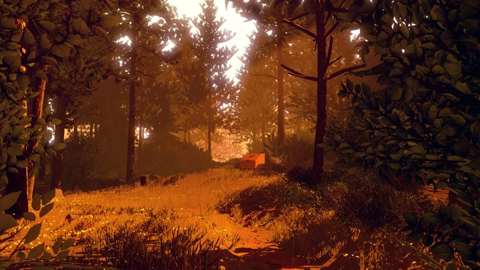
Firewatch is a beautiful game, rich in colour and depth. For Ng the aim was to achieve realism through stylised graphics.
“The world of Firewatch is visually very stylised,” she explains. “But for the world to be believable it has feel real. We really want the player to feel physically connected to Henry.”
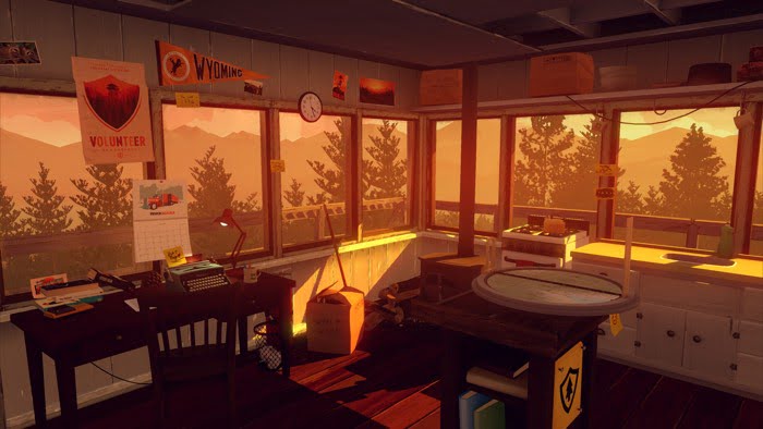
Using the example of Henry’s forest cabin Ng detailed the efforts used to forge that connection.
“It important that, as Henry, the player feels like he could live in this cabin as a lookout and that the forest around him is a place where he can have real thoughts, real worries and a real relationship over the radio with Delilah. The art really needs to support this sense of realness, despite whatever stylization.”
So how did that original poster image translate into a three-dimensional game? It began with the work of Moss says Ng. “His designs are great at communicating an idea while hitting the emotional tone of a subject.”
Another important element was the colour palette. “There are beautiful and bold colours here and they are in very distinct layers. Each layer adds to a feeling of depth and distance. Pretty perfect for a wilderness game,” she explains.
Ng then demonstrated how this bold simplicity was extended to the shapes used for objects within the game.
“Much of the composition is made with flat-shapes with strong, distinctive silhouettes with abstract internal details.”
Although this art style would translate easily to a 2D game, it was not so simple to transfer it into three dimensions. Ng turned to a dynamic solution to create the intended atmosphere.
“Since Firewatch takes place in the outdoors the biggest chunk of colour is actually determined by the sky. Sometimes it takes up half of the screen.”
Ng and the team tried a few ways to make their own sky boxes but settled on using the Unity lighting extension, Marmoset Skyshop.
“The upside of having a dynamic solution for lighting is that if you build an information manager on top of it you can change your colours on the fly as the player moves around.” she says.
The lighting is supplemented with the use of fog to create depth and distance. A variety of tools were used to achieve the effect Ng desired. These included Playmaker, SECTR, NGUI, Amplify and Skyshop.
“It’s very tempting to write your own tools because you know what you want, and you know how you want it. But it takes a long time to make good usable tools,” explains Ng. The cost of these tools was more than offset by the number of developer days saved and put to work on game play.
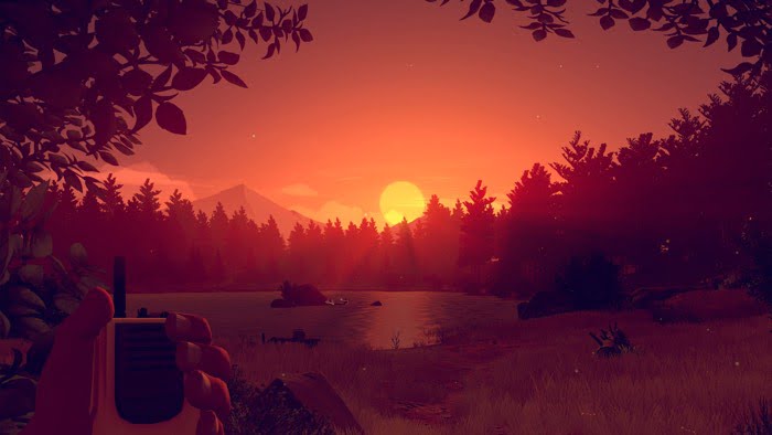
A colour script, aligned to key moments in the narrative, was also used to ensure consistency throughout the game.
“The colours are not just there to look beautiful. They really do drive the mood of the scene,” says Ng. “Since Firewatch is a narrative game we were pretty clear on what mood we were trying to tailor for each story moment.”
Colour is used to enhance the moment-to-moment mood of the game and be in harmony with the feelings experienced by the player as they progress.
“When the game is trying to introduce a mysterious, perhaps menacing, element you really want the mood of a scene to support that. You probably don’t want that crazy parade, birthday party colour scheme when you’re trying to be spooky.”
Ng also revealed how narratively important elements in the environment have more texture detail. This is to help communicate their significance to the player.
“There are clear advantages to this style choice,” she says. “It establishes a clear visual language, that any object with a certain level of texture detail is something that adds to your story, or is something to talk to Delilah about.”
Ng concluded her talk with a message on taking advantage of your limits and turning them into strengths.
“Embrace your limitations. A lot art and process decisions we made in developing Firewatch are defined by the people and technology we have available to us. Knowing what your limitations are and working within them can be very empowering.”
Should you play Firewatch? Read our review.