A games brand is more than a logo, but sometimes it starts with something as simple as a line.
There’s a running joke at PlayStation Studios Creative about a brand update to the Horizon franchise. “All we did was add a line,” says Senior Creative Director Matt Redway, with the weariness of someone who has clearly had to explain why designing “a line” took considerably longer than it sounds.
That line, a simple divider beneath the Horizon wordmark, reflects how PlayStation Studios Creative, the in-house agency supporting all PlayStation Studios titles, approaches branding as a flexible system.
Matt Redway and Senior Manager of Art and Design Alanna Cervenak explained this approach at the GDC Festival of Gaming session, Beyond the Logo: Crafting Comprehensive Brand Systems for Games.
The philosophy is straightforward, Redway says. “For games, the logo and key art for your game doesn’t constitute a full brand anymore.”
Instead, a brand is composed of ingredients including typography, colour palettes, shape, language, texture, motion, tone of voice, and editing style that all work together to form a coherent communication system. The goal, Redway says, is something that communicates a game to its audience in a way that is attractive, consistent and memorable.
Redway cites the famous adage that your brand is what people say about you when you’re not in the room. For games, that means the brand extends beyond anything the marketing team produces. It’s there in press coverage, website comment sections, store reviews, forums, social media, and in the player’s own experience.
“How does your shape language in the logo influence your call-to-action buttons? How does your brand tone of voice carry from trailer to tool tips?” Cervenak adds. “Always design with the next wave of content in mind and not just the single brief in front of you. Style guide fundamentals drift, logos get distorted, and over time it becomes unrecognisable to your core player.”

The Rubber Band
Cervenak says that as a game franchise grows through DLC, sequels, spin-offs, crossovers, and merchandise, its brand will be “stretched in every direction.” If it isn’t built to handle that strain, it starts to show.
The solution isn’t rigidity, but intentional flexibility. “What we want instead is a system that behaves like a rubber band instead of an immovable mountain,” Cervenak explains. “Something that is strong and simple and clear at its core, but that is intentionally built to bend, stretch, and accommodate new types of content without losing its soul.”
That balance of what can stay consistent and what can flex is, Cervenak says, the real craft of building a brand system for games. Lock in your typography as an immovable pillar. Let your colour system breathe. Or vice versa. The specific choices matter less than making them deliberately and early.
“Consistency gives players something to recognise, and flex gives them something to get excited about. You’re going to need both if you want your brand to truly live with your game.”
The Line
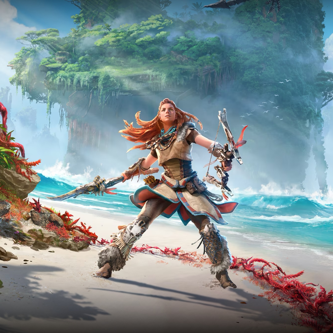
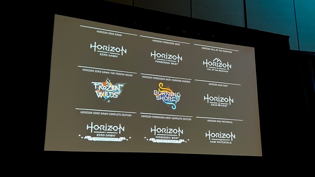
Horizon Zero Dawn launched in 2017 with a logo and visual identity created in partnership with Guerrilla Games. It was a strong foundation for what would become a multimedia franchise. When Guerrilla returned for the sequel, the challenge wasn’t just how to design a new logo, but how to design a system.
“What started as a single title has evolved into a rich, multi-dimensional universe,” Redway explains. “And today, Horizon extends far beyond its original game, spanning multiple releases and expansions, remasters, collabs, board games, toys, publishing, music, etc.”
One of the answers was that line. A divider placed beneath the core Horizon logo that creates a defined space for what Redway calls “evolving identifiers,” whether that’s a numeral (Horizon Zero Dawn and Horizon Forbidden West), a platform descriptor (VR, in the case of Horizon Call of the Mountain), or something else entirely. It’s a small addition formally establishing Horizon as a top-level brand, with each subtitle operating as a modular component beneath it.

To ensure those subtitles would remain consistent as the franchise expanded, PlayStation Studios Creative also developed a bespoke typeface. Machine Nova was built from the ground up by revisiting and refining the Horizon Zero Dawn lettering. “We enhanced legibility, recalibrated the kerning, and redesigned some of the letters,” Redway says. The typeface includes a full character set with numerals, symbols, and accents, giving it comprehensive language support while retaining the distinctive Horizon aesthetic.
The result takes a geometric sans serif and transforms it into a proprietary piece of the Horizon brand communication toolkit. It also means that internal teams and external partners can create new logos within the system without the whole thing falling apart, such as when Guerrilla’s own team designed the logo for the Gaia web series.
A second typeface, Hunter Nova, was developed for smaller applications such as UI, brand materials, and supporting copy. It supports the lowercase characters, small caps, and weights that Machine Nova’s more singular focus doesn’t accommodate. Conceptually, it reinforces what Redway describes as the franchise’s “hand-crafted pillar,” and balances the technological emphasis of the primary font.
Brand Flexibility
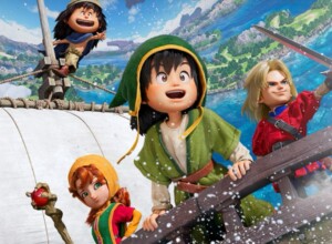
The system was tested most visibly with Lego Horizon Adventures. The collaboration called for something playful and tactile, but still on-brand. The team kept the core Horizon wordmark but created a custom sticker-style treatment for ‘Adventures,’ using Hunter Nova as its basis. And then they did the unthinkable: they removed the divider line.
“This felt like a really big deal at the time, but it was the right call,” Redway says. They also repurposed a minifigure head stud as the dot of the letter ‘i.’ It is a cheeky and delightful detail that matches the tone of the game.
The Lego example illustrates the broader principle. The Horizon logo system moves from disciplined consistency at its core to increasingly expressive interpretations at its edges. “The important thing is that it’s always intentional and ordered,” he says. “You really have to build the recognition first by being consistent, and then you can stretch the identity. Don’t start stretching it too soon, otherwise the brand problems will just become muddy and confusing.”

It’s advice that sounds obvious until you realise just how frequently some game properties have inconsistent brand execution.
The Horizon franchise, Redway notes, continues to expand. Each time, the brand is challenged to adapt, but because of the systems in place – including the line – the rubber band hasn’t snapped.
Read more reports from GDC Festival of Gaming 2026.