At GDC 2025, David Hellman offered a behind-the-scenes look at the challenges of developing the artistic direction for Arranger, the visually inventive puzzle-RPG from Furniture & Mattress.
The talk, “Arranger: A Convention-Breaking Art Direction,” explored the game’s evolving visual identity – from early demos to an ambitious 2.5D experiment – before culminating in the expressive, abstract style that defines its final look.
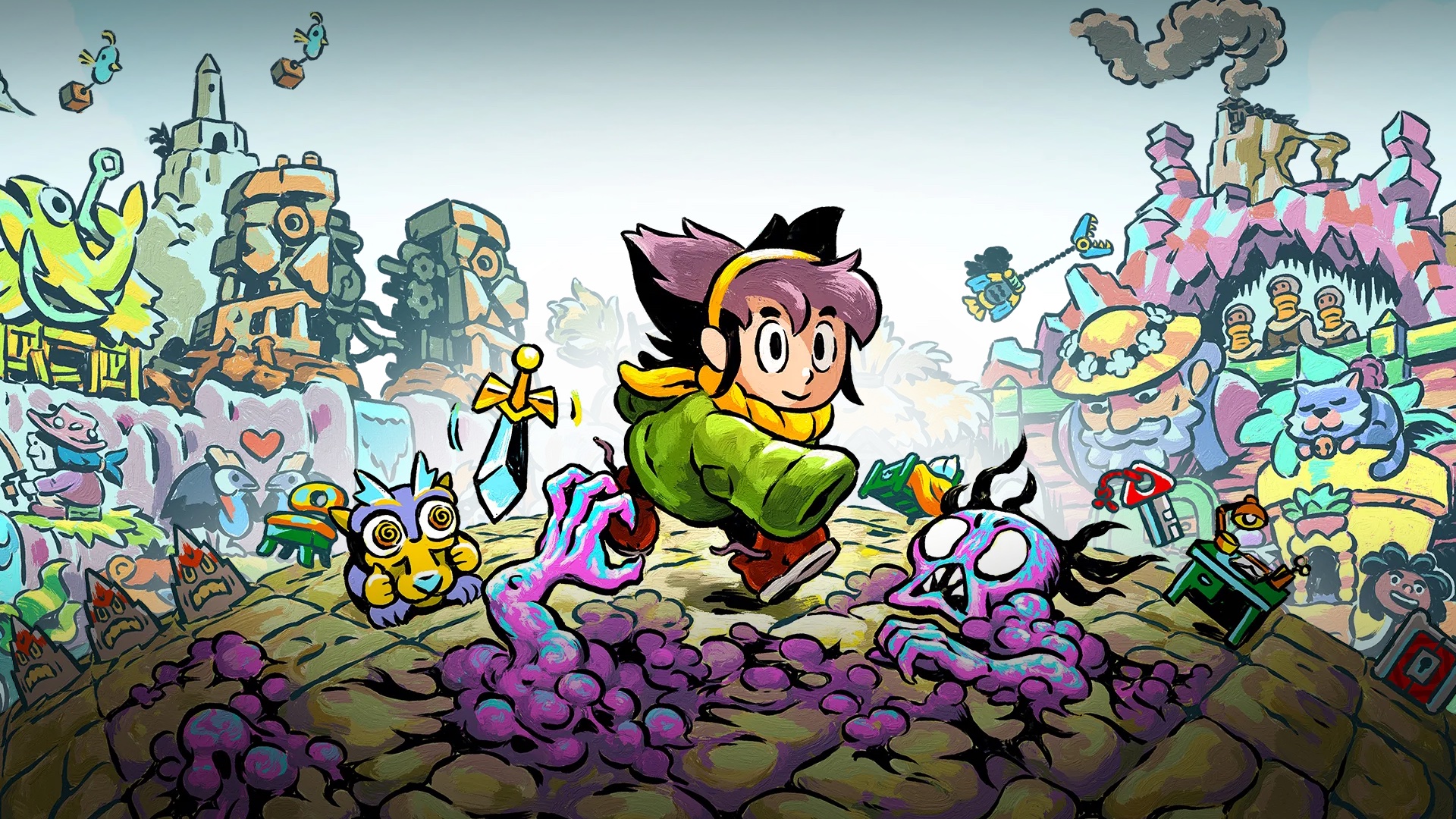
Hellman describes Arranger as a role-puzzling adventure set in a sliding world, like a Rubik’s Cube on a 2D grid. This traversal mechanic is central to the game’s identity and demanded visual clarity, as the tile grid shifts whenever Jemma, the protagonist, moves.
The project began with a simple monochrome prototype by designer Nicolás Recabarren that demonstrated the effectiveness of Arranger‘s gameplay concept.
“The gameplay is unique, but quite simple and constrained,” Hellman explains. “And it requires a very clear visual depiction of the grid.”

Tilt shift
Hellman’s early treatments introduced his trademark painterly style into the game to create atmosphere, while keeping the grid and its objects clearly legible. It was colourful and expressive, yet functional and modest in scope.
However, development took a significant turn after the game was funded. Recabarren proposed a new visual approach that tilted objects upright, giving the game a layered, board game-like sense of depth.
“This immediately brought parallax and depth into the world. The screen space felt so active and alive,” Hellman recalls. “I’m most motivated when I’m doing something that feels new. So maybe 2.5D would be that thing. Maybe I could do 2.5D in my own way?”
Despite the undeniable appeal of the 2.5D aesthetic, the shift in viewpoint increased visual complexity and compromised some of the game’s core simplicity. Questions around spatial logic, Z-sorting, and object layering quickly began to pile up.
“The visual and technical implications of this approach, we weren’t ready for all of them,” Hellman admits. “Complexity continued to expand rather than narrow.”
Eventually, the team concluded that following this path was unsustainable and increasingly at odds with the elegance of Arranger’s gameplay. As the development timeline threatened to stretch beyond its limits, the decision was made to revert to 2D. The shift left them with a visual style that lacked cohesion, and, as Hellman recalls, it was a period of demoralisation.
“Exploring 3D had distracted me from resolving the scenery painting style,” he adds. “There was too much disconnect between the demo’s smudgy, painterly scenery and the clean-line grid objects.”
Embracing simplicity
Hellman returned to the game’s earliest art concepts for inspiration, looking for underused ideas to exploit.
“There was something about these early impulses that were drawing me back,” Hellman says. “Maybe there was something I’d forgotten about. Maybe it was just because it looked so damned simple.”
Hellman shifted focus to the visual hierarchy and abstraction, unapologetically placing the grid back at the centre of the design. “The grid is primary. It’s unabashedly a puzzle game,” he says. “The scenery is only suggestive of the larger space.”

This process led to the concept of dividing the background into compositional fragments. Instead of constructing the environment with individual, repeated assets – such as trees – these fragments could suggest the presence of a forest without depicting it literally. The result was a more abstract but cohesive style that allowed gameplay elements to take priority while depicting a larger world around the player.
“This, to me, is like our perception, really. If you’re in a forest, there’s only a handful of trees that will catch your attention anyway. The rest will be a generalised backdrop,” Hellman explains.
Comics and story
The revised approach also brought narrative benefits by breaking free of the game’s strict top-down perspective. It allowed for comic-book-style fragments – called shards – that could depict environments from alternative angles or highlight character and story moments.
“This is comic storytelling built into the game with no interruption,” Hellman says. “Shards can expand on a character performance and sequential storytelling. A small number of scenery assets will suffice to populate a scene. And we now have a visual hierarchy of where your eye goes, what it’s drawn to, and what’s de-emphasised.”
A layer called the Smudge Field was also introduced as a transitional zone positioned behind the gameplay grid and scenery, but in front of more abstract visuals like shards and sky backdrops. Together, these components added depth without disrupting gameplay and established a coherent spatial logic for the environment.
“Previous attempts have fought the grid, struggling to absorb it into this environment,” Hellman explains. “But here I was able to think of the grid as almost the baseline in a song, like the main spine.”

The visual journey of Arranger reflects its gameplay: iterative, spatial, and occasionally emotional. Hellman and the Furniture & Mattress team ultimately found the right direction by stepping back and refocusing on what truly mattered. In solving the puzzle of its own visual identity, Hellman arrived at an artistic direction as clever and inventive as the game itself.
“I feel like there’s a frontier of surprise and novelty in our medium for each of us, something built on the particular motifs and questions that drive us as artists,” Hellman says. “I’m grateful that I got to explore that in this project.”
Read more from GDC 2025.